CSS3功能推荐及优化
border-radius
border-radius 用来设置边框圆角。当使用一个半径时确定一个圆形;当使用两个半径时确定一个椭圆,这个(椭)圆与边框的交集形成圆角效果。
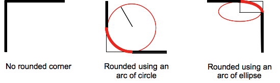
这是一个简写属性,用来设置 border-top-left-radius, border-top-right-radius, border-bottom-right-radius ,border-bottom-left-radius。
和其他简写属性类似,无法为个别值设定为继承,如 border-radius:0 0 inherit inherit,这会覆盖一部分现有定义。在这种情况下只能使用完整属性来指定。
语法
Formal syntax: [ <length> | <percentage> ]{1,4} [ / [ <length> | <percentage> ]{1,4} ]?

半径的第一个语法取值可取1~4个值:
border-radius: radius
border-radius: top-left-and-bottom-right top-right-and-bottom-left
border-radius: top-left top-right-and-bottom-left bottom-right
border-radius: top-left top-right bottom-right bottom-left

半径的第二个语法取值也可取1~4个值
border-radius: (first radius values) / radius
border-radius: (first radius values) / top-left-and-bottom-right top-right-and-bottom-left
border-radius: (first radius values) / top-left top-right-and-bottom-left bottom-right
border-radius: (first radius values) / top-left top-right bottom-right bottom-left

border-radius: inherit
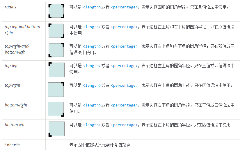
属性值
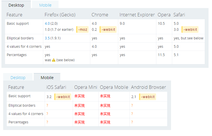
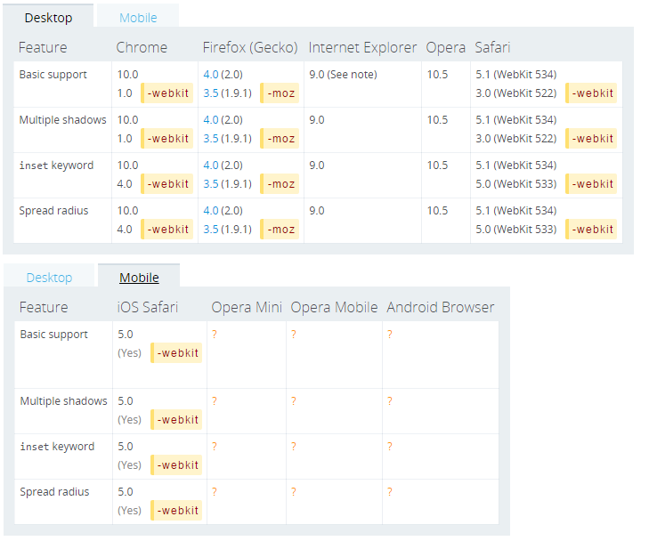
兼容性
注意css的书写顺序
      #wrongway {
        border-radius: 30px 10px;
        -webkit-border-radius: 30px 10px;
      }
      #rightway {
        -webkit-border-radius: 30px 10px;
        border-radius: 30px 10px;
      }
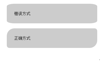
如果浏览器支持不同前缀的写法,就会产生样式重写。webkit核心的浏览器不仅支持border-radius属性,也支持-webkit-border-radius属性,所以产生了以上问题。
无前缀写法(border-radius),是让box左上角和右下角为30像素圆弧,左下角和右上是10像素圆弧。
webkit前缀写法(-webkit-border-radius),则让box渲染为每个角都是30像素宽10像素高的圆弧。
CSS3中的background-image 渐变貌似也有同样的遭遇
box-shadow
box-shadow 以逗号分割列表来描述一个或多个阴影效果,可以用到几乎任何元素上。如果元素同时设置了border-radius,阴影也会有圆角效果。多个阴影的z-ordering 和多个text shadows规则相同(第一个阴影在最上面)。
box-shadow是少有的几个可以省略前缀的CSS3属性,类似的还有box-shadow。不过遗憾的是,暂时移动端只有iOS支持,android是否可以用滤镜或其他方式实现有待进一步研究,见下面的兼容性表。
语法
none | [inset? && [ <offset-x> <offset-y> <blur-radius>? <spread-radius>? <color>? ] ]#
/* offset-x | offset-y | color */
box-shadow: 60px -16px teal;

/* offset-x | offset-y | blur-radius | color */
box-shadow: 10px 5px 5px black;

/* offset-x | offset-y | blur-radius | spread-radius | color */
box-shadow: 2px 2px 2px 1px rgba(0, 0, 0, 0.2);

/* inset | offset-x | offset-y | color */
box-shadow: inset 5em 1em gold;

/* Any number of shadows, separated by commas */
box-shadow: 3px 3px red, -1em 0 0.4em olive;
inset
默认阴影在边框外。使用inset后,阴影在边框内(即使是透明边框),背景之上内容之下。
<offset-x> <offset-y>
length值,用来设置阴影偏移量。<offset-x> 设置水平偏移量,如果是负值则阴影位于元素左边。 <offset-y> 设置垂直偏移量,如果是负值则阴影位于元素上面。
如果两者都是0,那么阴影位于元素后面。这时如果设置了<blur-radius> 或<spread-radius> 则有模糊效果。
<blur-radius>
length值,值越大,糊糊面积越大,阴影就越大越淡。 不能为负值。默认为0,此时阴影边缘锐利。
<spread-radius>
length值。取正值时,阴影扩大;取负值时,阴影.收缩。默认为0,此时阴影与元素同样大。
<color>
如果没有指定,则由浏览器决定——通常是color的值,不过目前Safari取透明。
兼容性
text-shadow
text-shadow 为文字添加阴影。可以为文字与 text-decorations 添加多个阴影,阴影值之间用逗号隔开。
每个阴影指定相对文字的偏移量,可选的颜色及模糊半径。多个阴影从前往后叠加,第一个阴影在最前面。
移动端暂时均未支持。
语法
text-shadow: offset-x offset-y blur-radius color;
<color>
可选。如果想让各浏览器保持一致,则应指定颜色
<offset-x> <offset-y>
必选。这些长度值指定阴影相对文字的偏移量。<offset-x> 指定水平偏移量,若是负值则阴影位于文字左边。 <offset-y> 指定垂直偏移量,若是负值则阴影位于文字上面。如果两者均为0,则阴影位于文字后面(如果设定了<blur-radius> 则会有模糊效果)。
<blur-radius>
可选。length值。如果没有指定则为0。值越大,模糊半径越大,阴影也就越大越淡。
multiple backgrounds
Background属性在CSS3样式中已经彻底改革,开始支持多背景图片。对不支持的浏览器确认使用了备用图片,否则,它将跳此属性,使背景图像留空。
.multi_bg_example {
  background-image   : url(https://mdn.mozillademos.org/files/11305/firefox.png),
                       url(https://mdn.mozillademos.org/files/11307/bubbles.png),
                       linear-gradient(to right, rgba(30, 75, 115, 1),  rgba(255, 255, 255, 0));

  background-repeat  : no-repeat,
                       no-repeat,
                       no-repeat;

  background-position: bottom right,
                       left,
                       right;
}
Demo中的多背景分别为Firefox的logo,气泡背景图,颜色渐变,多背景的设置用逗号分隔。
兼容性
background-size
语法
background-size: length|percentage|cover|contain;
length
设置背景图像的高度和宽度。第一个值设置宽度,第二个值设置高度。如果只设置一个值,则第二个值会被设置为 "auto"。

percentage
以父元素的百分比来设置背景图像的宽度和高度。第一个值设置宽度,第二个值设置高度。如果只设置一个值,则第二个值会被设置为 "auto"。

cover
把背景图像扩展至足够大,以使背景图像完全覆盖背景区域。背景图像的某些部分也许无法显示在背景定位区域中。

contain
把图像图像扩展至最大尺寸,以使其宽度和高度完全适应内容区域。
兼容性
text-overflow
text-overflow 属性用于决定溢出的内容以何种形式提醒用户。它可以直接剪切(clipped),也可以显示一个省略号( '…'),或者显示一个自定义的字符串(只有firefox支持)。
兼容性
opacity
透明opacity也可以使用rgba来实现。
{
    background-color:#000;
    opacity:0.6;
}
或者
{
    background-color:rgba(0, 0, 0, 0.6);
    opacity:0.6;
}
使用建议
- 浏览器的某些组件无法满足UI效果时,可以将组件隐藏,比如说select,input[file]等
- 错误提示和微信分享等半透明的遮罩层;
transform
transform 属性允许你修改CSS可视化模型的坐标控件。使用transform,元素可以按照设定的值变形、旋转、缩放、倾斜,即向元素进行2D和3D转换。与transition结合就可以实现很多CSS3动画。
2D转换
transform 2D的主要方法有:translate(),rotate(),scale(),skew(),matrix()。
translate() 方法 通过 translate() 方法,元素从其当前位置移动,根据给定的 left(x 坐标) 和 top(y 坐标) 位置参数:
div
{
  /*把元素从左侧移动 50 像素,从顶端移动 100 像素*/
  -webkit-transform: translate(50px,100px);    /* Safari and Chrome */
  -ms-transform: translate(50px,100px);        /* IE 9 */
  -o-transform: translate(50px,100px);        /* Opera */
  -moz-transform: translate(50px,100px);        /* Firefox */
  transform: translate(50px,100px);
}
rotate() 方法 通过 rotate() 方法,元素顺时针旋转给定的角度。允许负值,元素将逆时针旋转。
div { /*把元素顺时针旋转 30 度*/ -webkit-transform: rotate(30deg); /* Safari and Chrome */ -ms-transform: rotate(30deg); /* IE 9 */ -o-transform: rotate(30deg); /* Opera */ -moz-transform: rotate(30deg); /* Firefox */ transform: rotate(30deg); }- scale() 方法
通过 scale() 方法,元素的尺寸会增加或减少,根据给定的宽度(X 轴)和高度(Y 轴)参数:
div
{
  /*把宽度转换为原始尺寸的 2 倍,把高度转换为原始高度的 4 倍*/
  -webkit-transform: scale(2,4);    /* Safari 和 Chrome */
  -ms-transform: scale(2,4);    /* IE 9 */
  -o-transform: scale(2,4);    /* Opera */
  -moz-transform: scale(2,4);    /* Firefox */
  transform: scale(2,4);
}
优化建议
- 使用CSS 3D加速,-webkit-transform:transition3d和-webkit-transform:translateZ为了渲染3D样式,但我们设置值为0后,并没有真正使用3D效果,但浏览器却因此开启了GPU硬件加速模式。
transform: rotateZ(-180deg) translate3D(0,0,0);
transition
CSS 过渡(transition), 是 CSS3 规范的一部分,可以让属性的变化过程持续一段时间,而不是立即生效,将按一个曲线速率变化,这个过程是可以自定义。比如,将元素的高度从0%变为100%,将元素的颜色由白色变为黑色等。
通常将两个状态之间的过渡称为隐式过渡 implicit transitions ,因为开始与结束之间的状态由浏览器自行决定。
过渡可以决定哪些属性发生动画效果 (明确地列出这些属性),何时开始 (设置 delay), 持续多久 (设置 duration) 以及如何动画 (定义timing函数,比如匀速地或先快后慢)。
语法:
transition是简写属性,有以下四个属性值:
transition : [<'transition-property'> || <'transition-duration'> || <'transition-timing-function'> || <'transition-delay'> [, [<'transition-property'> || <'transition-duration'> || <'transition-timing-function'> || <'transition-delay'>]]*
    伪css:
    div {
        transition: <property> <duration> <timing-function> <delay>;
    }
- transition-property:执行变换的属性
- 当其值为none时,transition马上停止执行
- 当指定为all时,则元素产生任何属性值变化时都将执行transition效果
- ident是可以指定元素的某一个属性值。其对应的类型:color(background-color,border-color,color等),length(width,height,top,padding,margin等)和transform等
- transition-duration:变换持续的时间
transition-timing-function:在延续时间段,变换的速率变化
可用属性:
ease | linear | ease-in | ease-out | ease-in-out | cubic-bezier(<number>, <number>, <number>, <number>)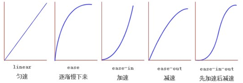
cubic-bezier为通过贝赛尔曲线来计算“转换”过程中的属性值
- transition-delay:变换延迟时间
- 当改变元素属性值后多长时间开始执行transition效果
- 改变多个css属性的transition效果,可以有各自不同的延续时间和其时间的速率变换方式;
- transition-delay与transition-duration的值都是时间,所以要区分它们在连写中的位置,一般浏览器会根据先后顺序决定,transition-duration | transition-delay;
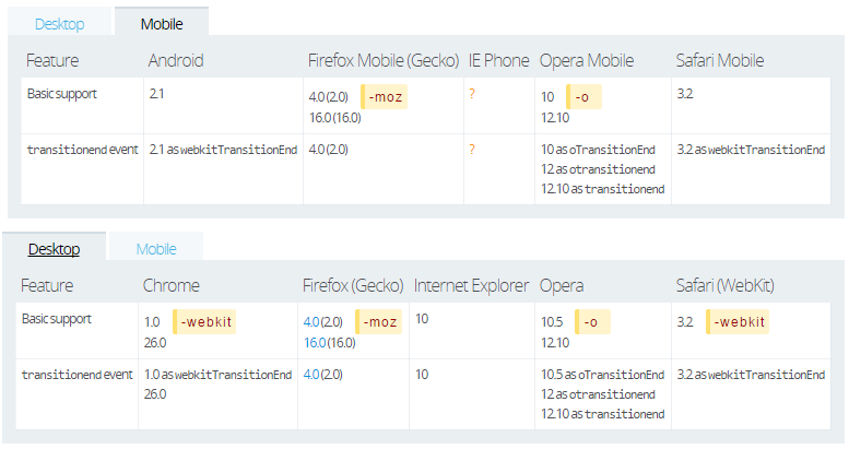
相关事件
检测过渡是否完成,在符合标准的浏览器下,这个事件是 transitionend, 在 WebKit 下是 webkitTransitionEnd。
- propertyName: 字符串,指示已完成过渡的属性。
- elapsedTime: 浮点数,指示当触发这个事件时过渡已运行的时间(秒)。这个值不受 transition-delay 影响。
- 如果取消了过渡则不会触发 transitionend 事件。
注意事项:
- 目前,各大浏览器(包括IE 10)都已经支持无前缀的transition,所以transition已经可以很安全地不加浏览器前缀。兼容性表格如下:
- 不是所有的CSS属性都支持transition,完整的列表查看这里,以及具体的效果。
- transition需要明确知道,开始状态和结束状态的具体数值,才能计算出中间状态。比如,height从0px变化到100px,transition可以算出中间状态。但是,transition没法算出0px到auto的中间状态,也就是说,如果开始或结束的设置是height: auto,那么就不会产生动画效果。类似的情况还有,display: none到block,background: url(foo.jpg)到url(bar.jpg)等等。
- 同时应当留意这种情形,在插入元素(如 .appendChild())或改变属性 display: none 后立即使用过渡, 元素将视为没有开始状态,始终处于结束状态。简单的解决办法,改变属性前用 window.setTimeout() 延迟几毫秒。
- 如果发现过渡效果不顺畅,可以尝试使用setTimeout延迟改变元素的CSS属性(比如使用增减class来改变CSS属性的情况)。
局限:
transition的优点在于简单易用,但是它有几个很大的局限。
- transition需要事件触发,所以没法在网页加载时自动发生。
- transition是一次性的,不能重复发生,除非一再触发,请使用animation。
- transition只能定义开始状态和结束状态,不能定义中间状态,也就是说只有两个状态。CSS的animation可以解决这个问题,能够指定动画的多个中间状态。
animation
scrolling on mobile
在iOS上,下面的CSS能够提供流畅如原生般的滚动体验。不过在Android上就会有问题,因为元素的height被设置为定值,整个元素就无法滚动了,将height设置为auto,是可以暂时解决问题的,但当元素DOM结构变化后,height变大后又不能向下滚动了。而且height设置为auto后,iOS的滚动又会不流畅,尴尬。
.module {
  width: 300px;
  height: 200px;/*or 100%.  if set 'auto', no smooth scrolling on iOS*/

  overflow-y: scroll; /* has to be scroll, not auto */
  -webkit-overflow-scrolling: touch;
}
Flexible Box Model
更多资料
============= @bryan